
Appearance
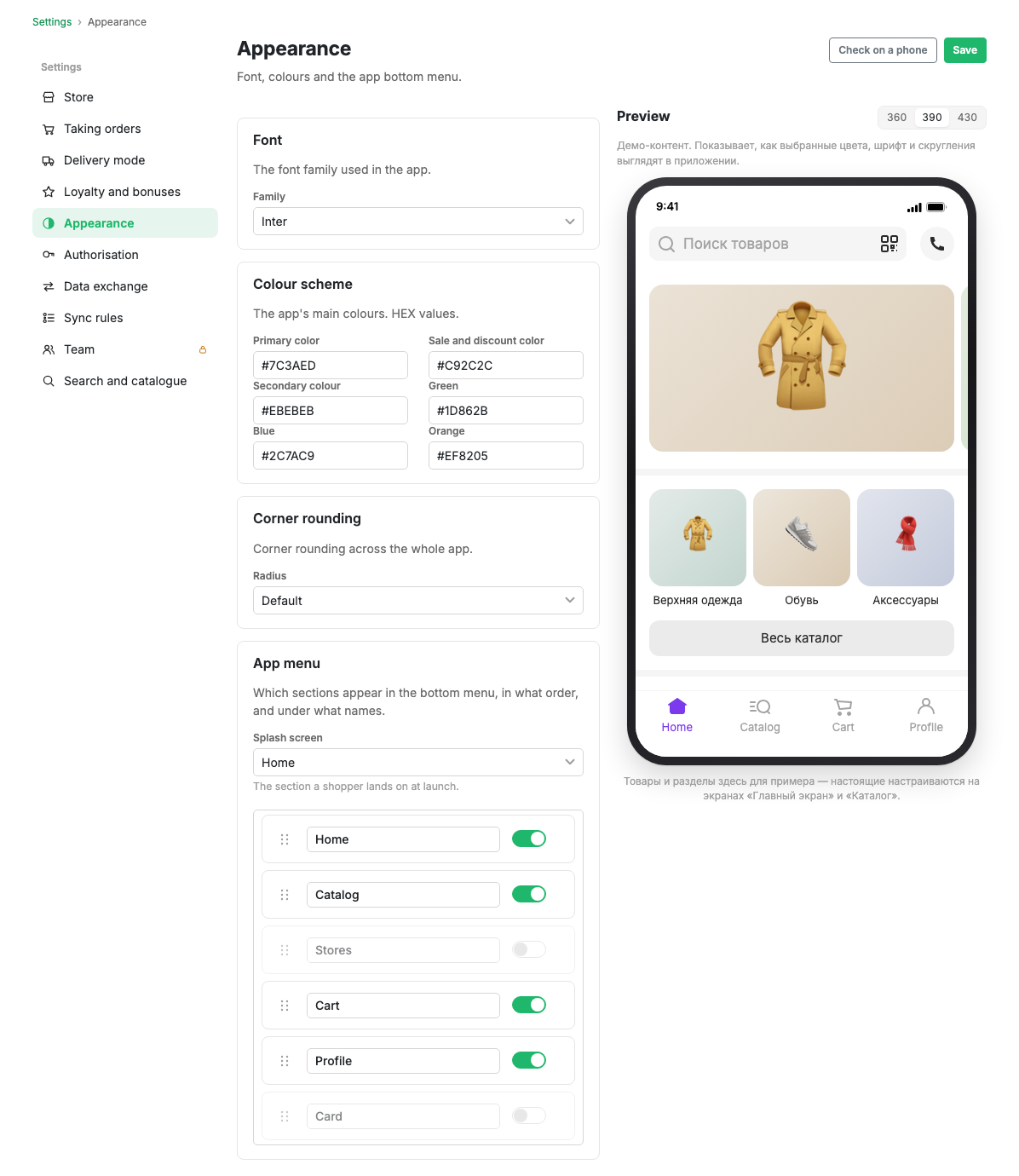
Font, colours, corner radius and the contents of the app bottom menu. A preview on the right shows your choices on a phone mock-up immediately, before saving.
How to open it
Settings, the Appearance group.
Font
The font family the whole app is set in. Chosen from a ready list.
Colour scheme
Six colours, given as HEX values:
| Colour | Where it is used |
|---|---|
| Primary | Buttons, active elements, selection |
| Sale and discount colour | Old price, discount badge, sale labels |
| Secondary | Block backgrounds and inactive states |
| Green | Confirmations and positive statuses |
| Blue | Informational hints |
| Orange | Warnings |
Corner radius
The corner radius across the whole app: default, minimal or none. It changes cards, buttons, input fields and photos at once.
App menu
The app bottom menu: contents, order and captions.
- Start screen: the section the shopper sees on launch.
- The list of sections: Home, Catalogue, Stores, Basket, Profile, Card. The switch on the right includes a section in the menu, the field on the left sets its caption, and the handle lets you drag a section up or down.
Stores is worth turning on once you have points of sale, and Card once the bonus programme is running.
The preview
The phone mock-up on the right shows the chosen colours, font and radius on sample content. The width can be switched between 360, 390 and 430 points to see how things sit on a narrow and a wide screen.
The products and sections there are examples. The real ones are configured on the Home screen and Catalogue screens.
The "Open on phone" button opens the demo environment, where the same thing is visible in the real app.